
WALLS & FLOORS · COORDINATED COLLECTIONS
Solid colours · Porcelain tiles
With fewer printed features, a solid-colour tile makes grout, alignment and colour relationships more visible. The tiled grid can be deliberately graphic or kept quiet. Decide which reading belongs in the room before choosing the joint colour and mixing other surface effects.

1 matching surfaces

No matching products. Try another search or look.
MATERIAL EDIT
Plain-colour tiles make the module part of the design
Compare the whole grid with the surrounding geometry
A plain wall can expose an awkward cut at a window or a misaligned row beside cabinetry. Prepare the elevation with the actual tile module and show openings. Symmetry around the principal feature may matter more than centring the tile grid on the entire wall.
- Set out rows around visible openings.
- Compare full pieces and perimeter cuts.
Test shade and sheen together
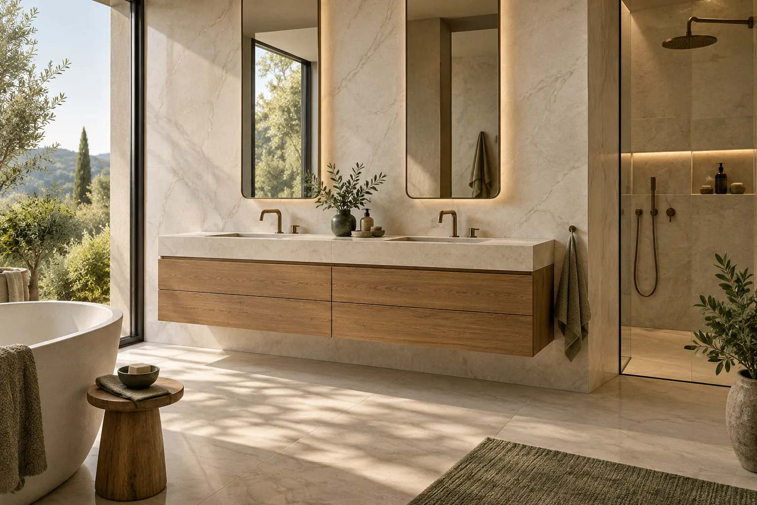
Two surfaces that look similar in colour may read differently when one reflects light. Review the selected tile under the intended viewing conditions. Where different sizes or finishes meet, confirm the colour relationship rather than assuming that one colour name guarantees an exact visual match.
- Place adjacent finishes in one sample board.
- Check the joint colour in both bright and shaded areas.
Build a dealer display around a small, readable colour family
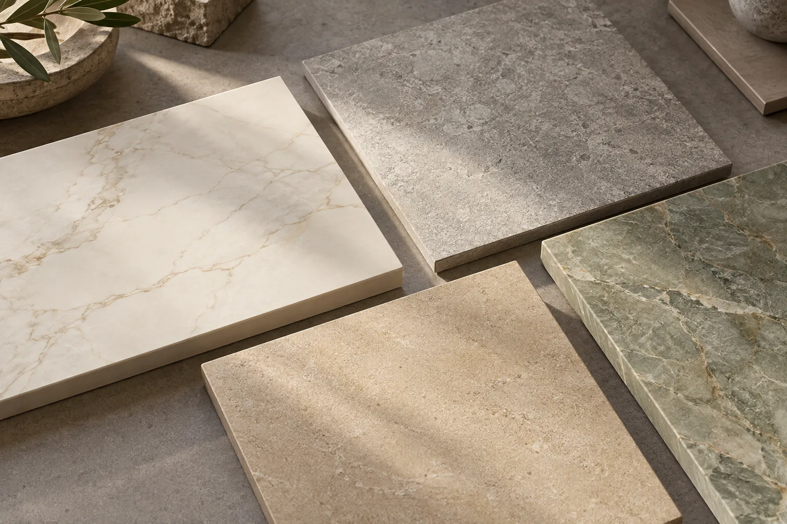
A wall of unrelated plain-colour samples can offer many choices while giving the customer little guidance. Organise the display around a clear family: a base tone, a lighter or darker companion and an accent that has a reason to be there. Show the intended colour relationship at the same time as the individual model references. If the display includes more than one size, identify each combination rather than allowing visitors to assume that every colour has every format. A focused board makes it easier for a dealer to explain the range and for a buyer to describe an alternative when a preferred combination has not yet been confirmed.
- Give every displayed colour a role within the palette.
- Label the exact colour-and-format combinations being shown.
MATERIAL EDIT
Plain-colour tiles make the module part of the design · Selection notes
| Decision | Review | Record |
|---|---|---|
| Module | Rows around the main feature | Wall elevation |
| Shade relationship | Adjacent formats or finishes | Combined samples |
| Joint emphasis | Graphic or quiet grid | Grout mock-up |
Solid colours · Porcelain tiles
Questions buyers ask
Can I create a checkerboard from any two plain tiles?
Check actual dimensions, thickness, edge conditions and the intended joint arrangement first. Two colour choices alone do not establish a compatible module.
Will the same named colour look identical in different finishes?
It may read differently because of reflection and texture. Review the actual samples together where the finishes will meet.
LET’S START A CONVERSATION
Your next project
starts with a surface.
Tell us what you are sourcing. We will help turn your requirements into a clear product enquiry.